Client
FaithConnect
Discipline
App Design
Branding
Collaborators
Miles Nanton

“Digital” is no longer a vague or distant concept — it’s as accessible as a book on a library shelf. Each of us began our digital journey at some point, and during COVID we were propelled fully into a new, online world. What once felt optional quickly became essential.
Churches, too, have embraced this shift. Today, tithes and offerings can be given with a simple tap or click, making generosity more convenient and consistent than ever before.
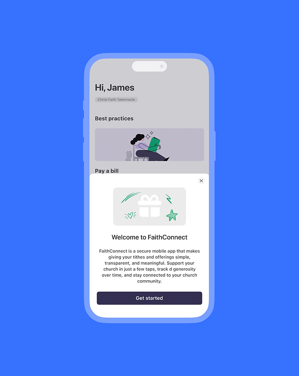
FaithConnect makes this experience seamless. The app enables congregational members to give their tithes and offerings digitally — and rewards them for doing so. It’s a modern solution that supports faithful giving while strengthening engagement within the church community.
Mylo has developed a new app for FaithConnect with the collaboration focused on app design and branding.
The project began when Dwight, the CEO and founder, identified the need for a simpler way for congregational members to give. He also wanted church administrators to be able to easily export Gift Aid data through a backend dashboard, streamlining their processes and reducing administrative burden.
FaithConnect represents the core purpose of the app — connecting faith with action. Giving is a central expression of faith within churches. The app bridges the gap between intention and action, allowing members to connect their generosity directly to their church in a seamless, modern way. It removes friction, making giving simple, accessible, and consistent.
Before developing FaithConnect, we conducted detailed research into existing digital church giving platforms. Rather than focusing only on surface-level features, we analysed real user reviews to understand where these platforms were failing functionally, technically, and emotionally. Giving is not simply a financial transaction; it is an act of faith rooted in trust. When the technology fails, that trust is compromised.
Our research revealed consistent and repeated friction points across competitor apps that directly undermine user confidence and generosity.
One of the most significant issues we identified was technical instability. Users frequently reported app freezing during signup or payment, recurring giving screens hanging, and transactions failing after completing the full process. Error messages such as “invalid token” appeared without explanation, blocking payments entirely. In some cases, even basic number entry fields malfunctioned, duplicating digits and making it impossible to enter an intended amount. Updates often introduced new bugs or removed previously reliable functionality. These issues resulted in failed payments, frustration, and in many cases, users abandoning the platform altogether.
We also observed serious concerns around payment security and transparency. Users described experiences of double charges, unclear refund processes, and difficulty removing saved card details. Some reported unexpected debits from updated cards, which created anxiety and eroded trust. In financial applications—especially those connected to churches—any ambiguity around payment handling is damaging. When users feel uncertain about where their money is going or how it is being processed, the emotional barrier to giving increases significantly.
Another recurring frustration was the removal of core features after visual updates. While some redesigns appeared more modern, they reduced usability. Users who were previously able to split their giving between tithe, offering, and specific departments within a single transaction were suddenly forced to complete multiple transactions. What once took seconds began taking twenty to thirty minutes. In several cases, users reverted to web interfaces or even returned to writing checks because the app no longer delivered on its promise of convenience.
The overall giving flow in competitor apps often lacked clarity and confidence-building design. Fund designations were sometimes hidden until late in the process, or displayed in pop-up windows that reduced visibility. Basic navigation elements, such as back buttons, were missing. Address information failed to save properly, forcing users to repeatedly re-enter their details. These friction points compounded into a frustrating experience during what should be a seamless and meaningful moment of generosity.
Flexibility was another limitation. Many platforms only allowed users to connect to a single church, preventing those who support multiple ministries from giving freely. Similarly, the inability to easily split gifts across multiple departments restricted user autonomy and reduced generosity potential. These structural limitations do not reflect the reality of modern church engagement.
Signup friction and inadequate support further contributed to dissatisfaction. Users described unnecessary or intrusive questions during registration, mandatory fields that created barriers, forms freezing upon submission, and a lack of responsive human support. In several cases, complaints were met with generic AI-generated responses rather than meaningful assistance. This left churches and individuals feeling unsupported and unheard.
FaithConnect is being built specifically to eliminate these pain points through what we describe as a trust-first architecture. Stability will take priority over feature expansion, with rigorous testing of payment flows and recurring giving systems to ensure reliability. Every stage of the giving journey will support clear navigation and user control. Payment transparency will be central to the experience, with visible fund designation before confirmation, instant receipts, easy refund pathways, and full control over stored payment methods.
Multi-giving will be seamless and intuitive. Users will be able to split gifts across tithe, offering, and departments within a single transaction, as well as support multiple churches where desired. Core functionality will never be removed in updates, and improvements will be rolled out with careful testing to avoid regression.
Most importantly, FaithConnect recognises that giving is sacred. Technology must reinforce confidence, not introduce doubt. By removing friction, protecting trust, and designing around real user frustrations, FaithConnect aims to provide a giving experience that is secure, transparent, and empowering for both churches and their members.
“Digital” is no longer a vague or distant concept — it’s as accessible as a book on a library shelf.


We selected SF Pro to ensure complete clarity across all text and calls to action, creating a clean, focused, and highly legible user experience. Its modern, neutral tone supports usability while allowing key actions to stand out without distraction.
For the brand palette, we chose a rich purple called Space Indigo as our primary colour, supported by lighter shades of purple, blue, and green as secondary accents. Purple was intentionally selected for its strong association with generosity, faith, and giving. The deeper Space Indigo conveys trust, stability, and reverence, while the lighter supporting tones introduce warmth, approachability, and balance across the interface.




Let's work together
We’re a design studio from London. We give startups, brands and organisations a pushup and help them to refine their digital product ambitions.